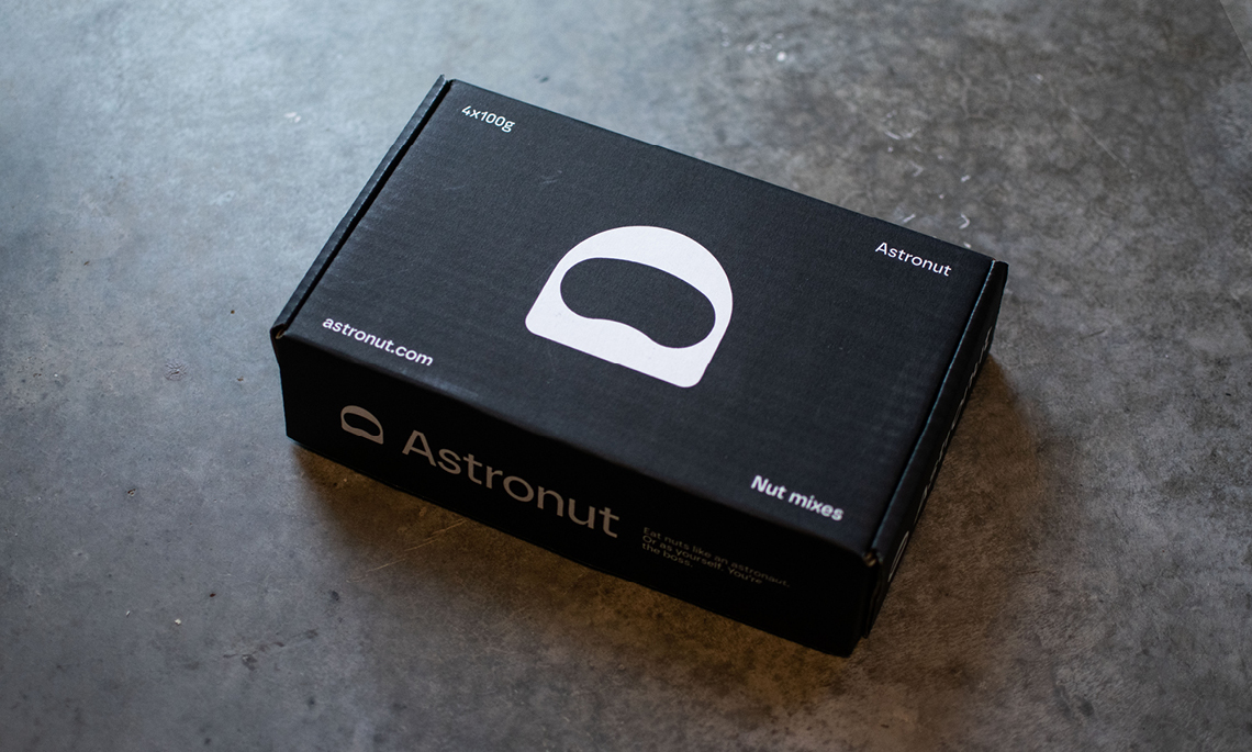
→ Företagsnamn, logotyp, grafisk identitet, copy, produktdesign, illustrationer och UI-design
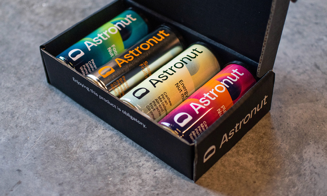
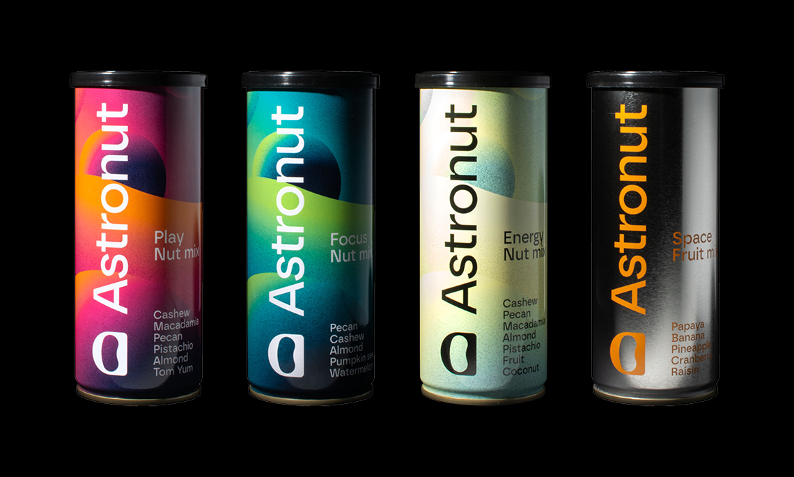
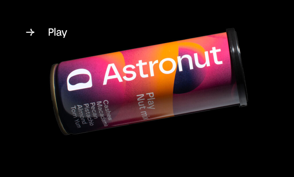
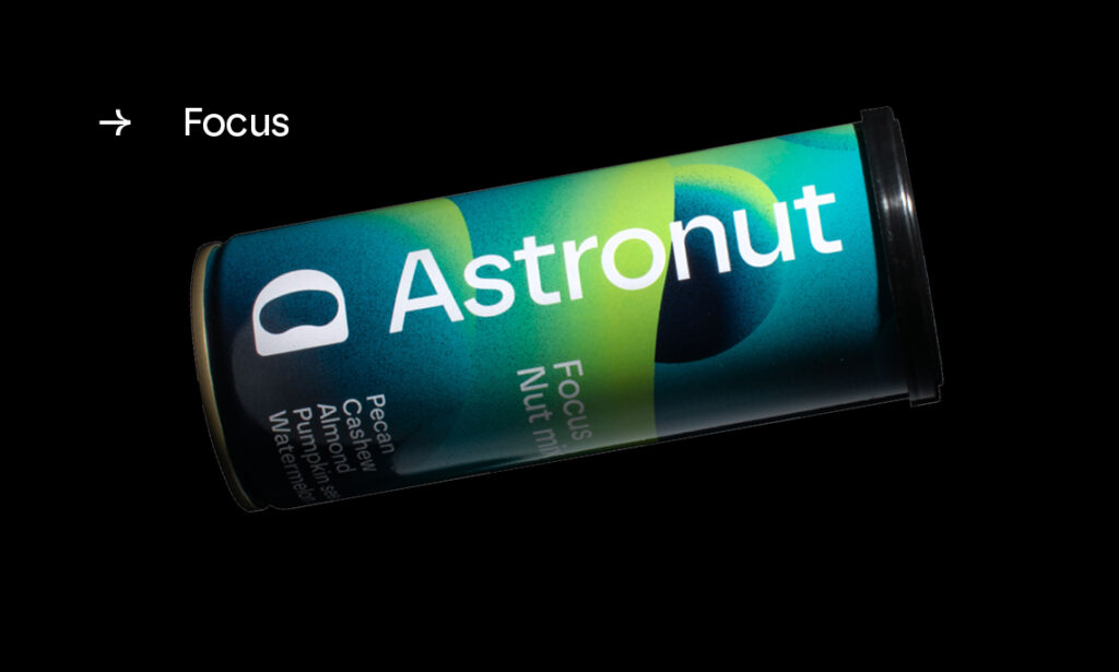
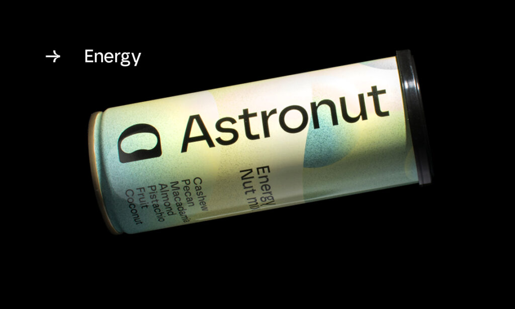
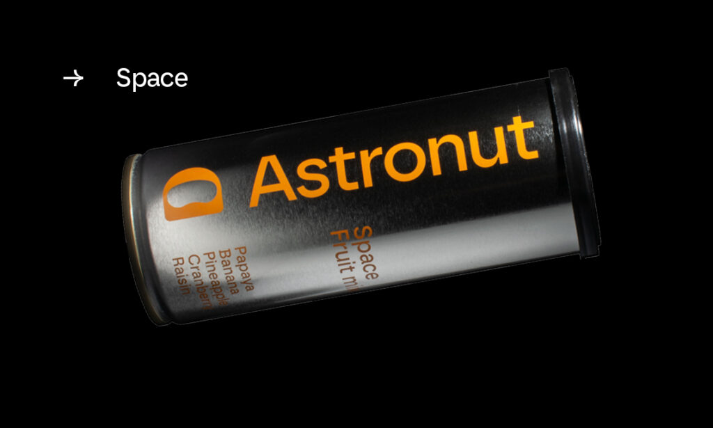
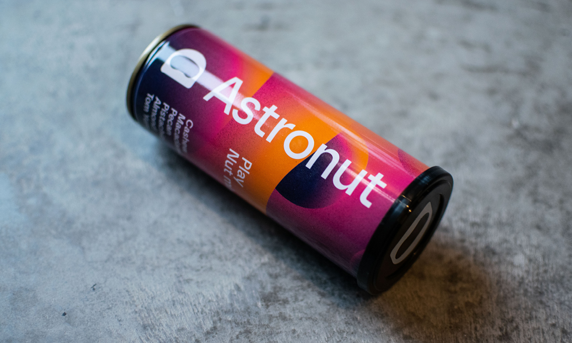
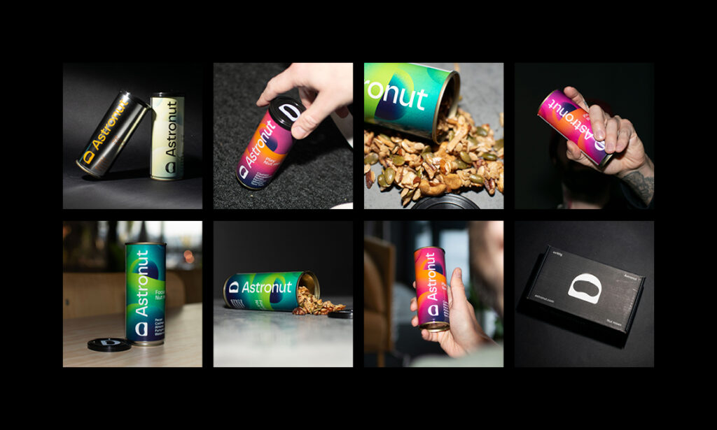
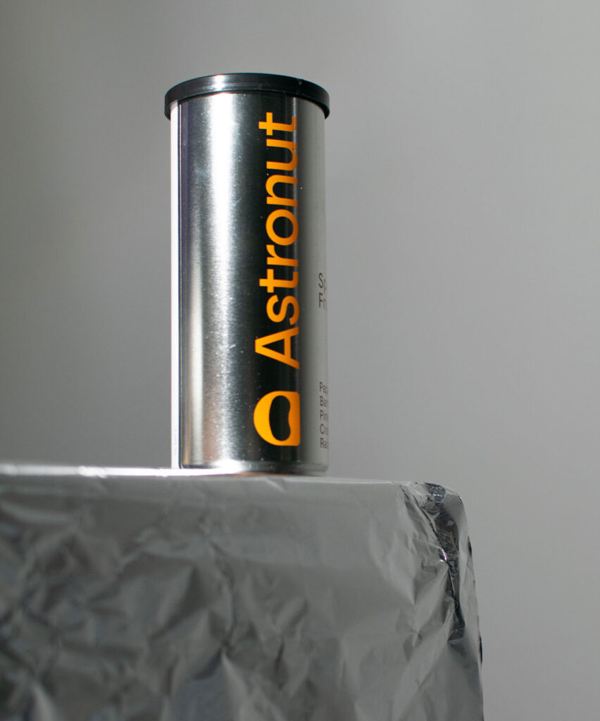
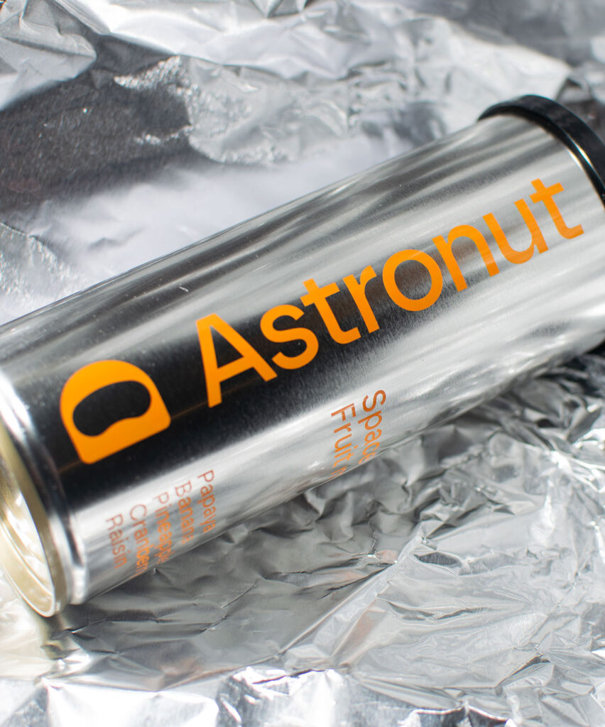
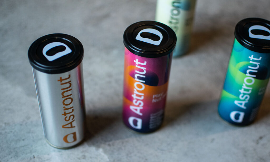
Astronut tillverkar nötmixar i återförslutbara burkar. Produkten kan konsumeras utan att kunden behöver ta i själva nötterna, utan istället häller i sig mixen likt en dryck.
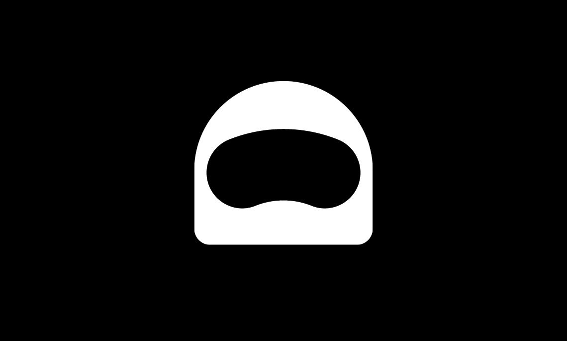
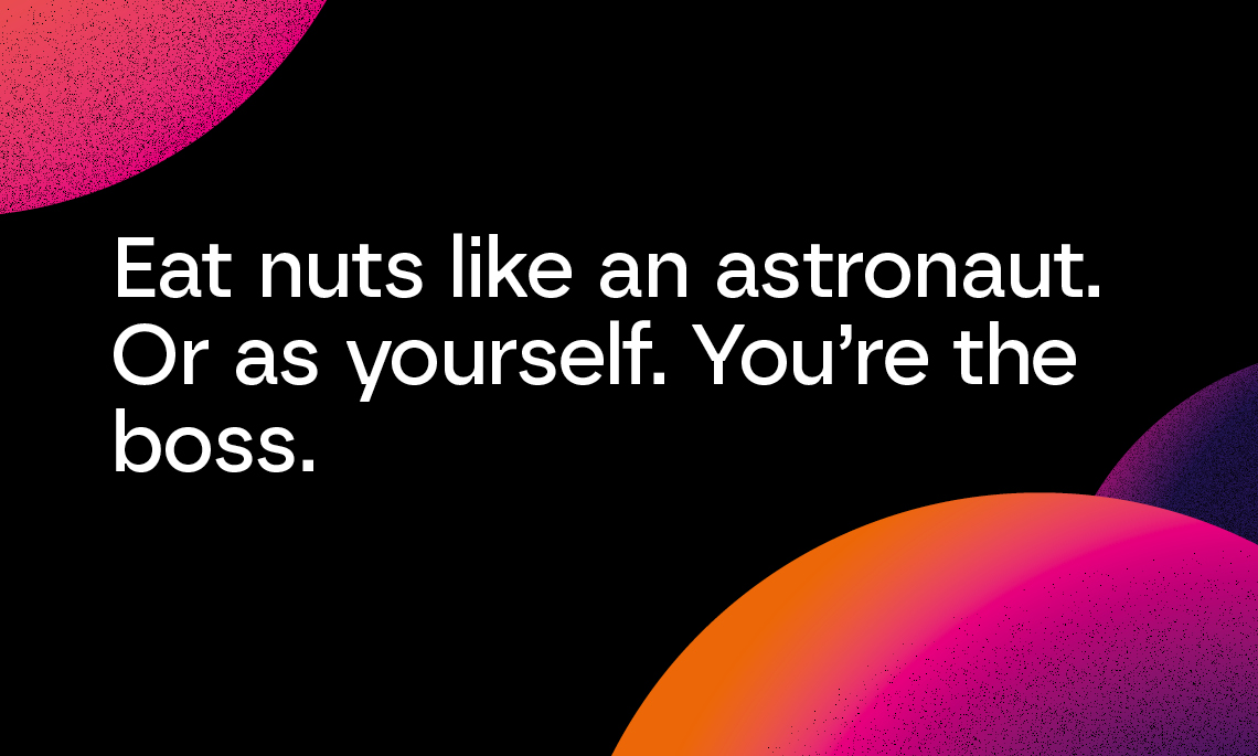
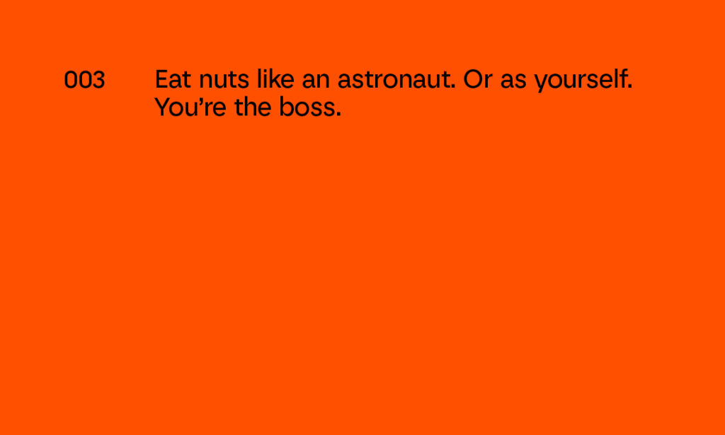
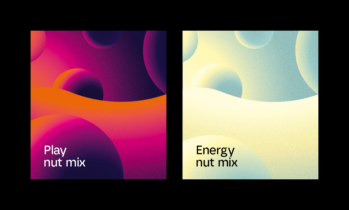
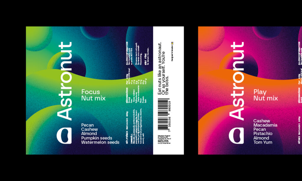
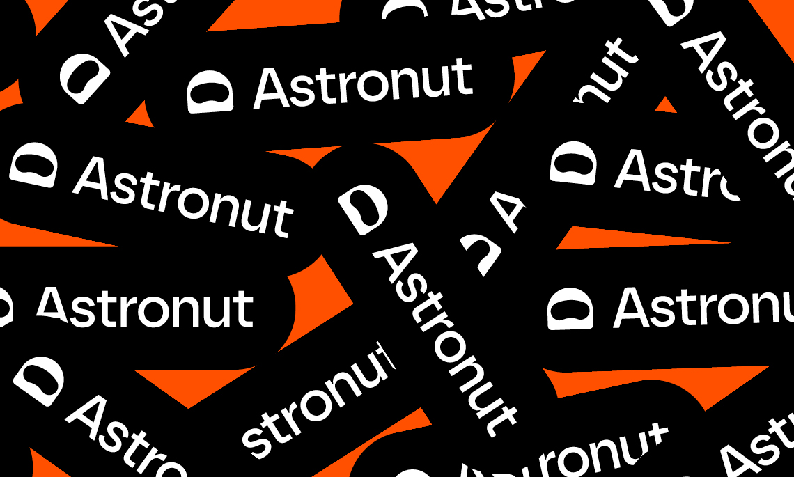
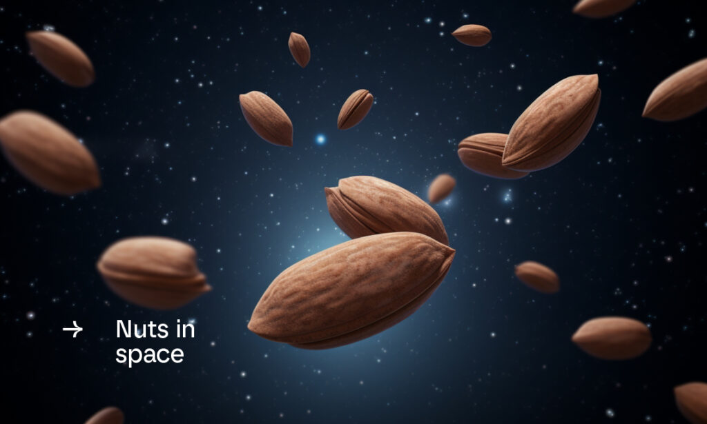
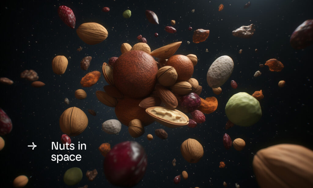
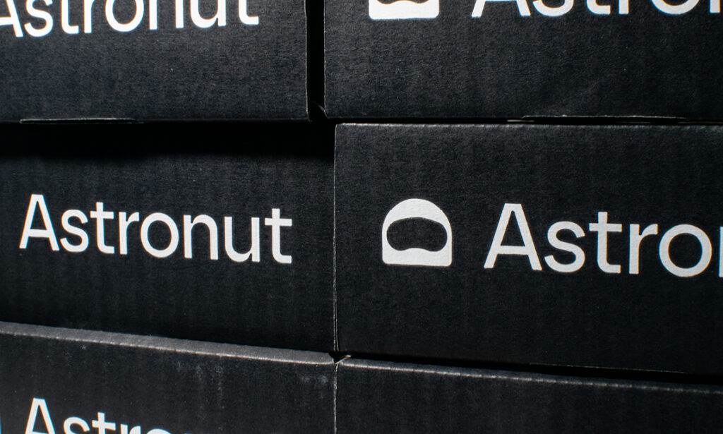
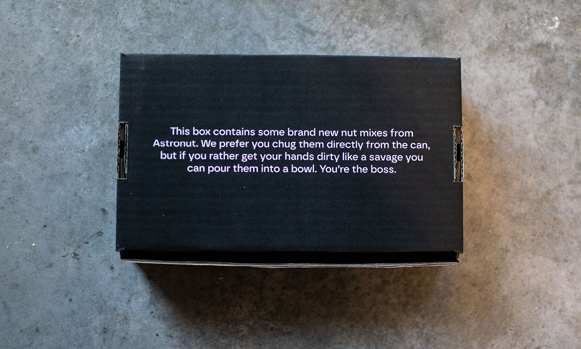
Namn och copy togs fram med aspiration som huvudspår – viljan att lyckas med något. Eat nuts like an Astronaut. Or as yourself. You’re the boss. Produktdesignen sattes utifrån samma idé, där nötinspirerad grafik bildar planeter och abstrakta bakgrundsformer. Logotypen symboliserar en astronauthjälm med en cashewnöt som visir.
”The icon is a triumph with an abstract, Among Us-esque space helmet with a visor shaped like a nut that pays off of the name brilliantly and cleverly. The execution is perfect and the simplicity of it, and how easily it conveys its concept, is one giant leap for mankind. The wordmark, in atipo’s Borna, looks pretty good and the ink traps are sort of warranted this time, giving off an engineered look that is fitting for the space theme… Overall, a great concept from product to logo that, to be honest, makes me question if this is real… as if it’s too good to be true.”